


Key Performance Indicators (KPIs): How do you design a dashboard that does more than just list numbers?
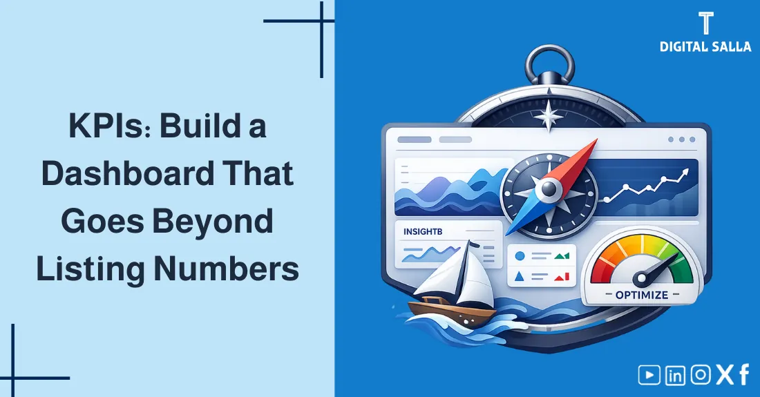
Key Performance Indicators (KPIs): How to Design a Dashboard That Does More Than Just List Numbers?
Key Performance Indicators (KPIs): A professional guide on how to define strategic metrics, build a balanced Financial Dashboard, and use data visualization to support decision-making beyond simple reporting—Digital Salla.
- What are KPIs and how to distinguish them from simple metrics?
- Leading Indicators (Predictors) vs. Lagging Indicators (Results).
- How to select the “Vital Few” metrics for your Financial Dashboard.
- Visual Design Principles: Using the “Z-pattern” and “Five-Second Rule.”
- Steps to implement a reporting system that drives corrective action.
1) The Concept of KPIs
A KPI (Key Performance Indicator) is a measurable value that demonstrates how effectively a company is achieving its key business objectives. Not every metric is a KPI. “Monthly Revenue” is a metric, but “Revenue Growth per New Customer” is a KPI because it measures Efficiency and Strategy.
2) Leading vs. Lagging Indicators
A balanced dashboard must include both types to provide a full picture of the past and future.
3) Selecting the “Vital Few” Metrics
Use the SMART criteria to select your KPIs: Specific, Measurable, Achievable, Relevant, and Time-bound.
- Business Model Alignment: A SaaS company focuses on “Churn Rate,” while a factory focuses on “Overall Equipment Effectiveness (OEE).”
- Hierarchy: The CEO needs 3-5 high-level metrics; the Operations Manager needs 10 detailed ones.
4) Designing the Dashboard (Visual Logic)
A Financial Dashboard is a tool for rapid cognition. Follow these design rules:
Budget vs Actual Variance Analysis - Excel File
4.1 The Z-Pattern
Place the most critical “Panic” numbers in the top-left corner, as that’s where the human eye starts scanning.
4.2 The Five-Second Rule
A user should understand if the business is “On Track” or “In Trouble” within 5 seconds of glancing at the screen.
4.3 Color Semantics
Use Green for on-target, Yellow for caution, and Red for immediate action. Avoid “Rainbow Dashboards.”
5) Essential Financial KPIs to Track
| KPI Name | Formula / Logic | What it tells management? |
|---|---|---|
| Net Profit Margin | (Net Income / Revenue) × 100 | Overall profitability efficiency. |
| Current Ratio | Current Assets / Current Liabilities | Short-term liquidity and solvency. |
| DSO (Days Sales Outstanding) | (Avg AR / Total Credit Sales) × Days | How fast are we collecting cash from customers? |
| Operating Cash Flow | Cash from core business operations | Can we survive without external funding? |
6) Essential Operational KPIs
- Inventory Turnover: How many times we sell and replace inventory (Efficiency).
- Capacity Utilization: How much of our factory’s potential is actually being used?
- Customer Acquisition Cost (CAC): Total Marketing Spend / New Customers.
- Employee Productivity: Revenue per Full-Time Employee (FTE).
7) Choosing the Right Chart Type
Data visualization is about choosing the right “Tool” for the “Information”:
- Line Charts: Best for showing Trends over time (Revenue growth).
- Bar Charts: Best for Comparing categories (Sales by region).
- Pie Charts: Use sparingly, only for Composition (Market share).
- Gauges/Bullets: Best for Actual vs. Target comparison.
8) Operational Controls & Readiness Checklist
To ensure your KPI Dashboard remains a source of truth:
Dashboard Quality Gate
- Are the data sources (ERP/CRM) integrated or manually entered? (Integrated is better).
- Is the “Refresh Frequency” aligned with the speed of the business (Daily/Weekly/Monthly)?
- Do all KPIs have a Clear Owner who is responsible for the result?
- Is there a “Definitions Glossary” so everyone knows exactly how a metric is calculated?
- Is the dashboard accessible to the right people (Security & Permissions)?
9) Common Errors and How to Prevent Them
- Vanity Metrics: Tracking things that look good but don’t drive profit (e.g., total registered users instead of active paying users).
- Inaccurate Data: Building a beautiful dashboard on top of messy accounting books.
- Metric Overload: Having 50 charts on one screen. Pro Tip: Use “Drill-down” functionality for details.
- Static Targets: Keeping the same targets even when market conditions change drastically.
10) Frequently Asked Questions
How many KPIs should be on a dashboard?
For a single screen, aim for 5 to 9 critical indicators. Any more will clutter the view and dilute the focus.
What is a Balanced Scorecard (BSC)?
It is a strategic framework that looks at the business from four perspectives: Financial, Customer, Internal Process, and Learning/Growth.
Should dashboards be built in Excel or Power BI/Tableau?
Excel is great for prototyping and small businesses. Power BI or Tableau are better for large datasets, real-time automation, and interactive sharing.
11) Conclusion
A KPI Dashboard is the “Cockpit” of your business. By moving beyond simple lists of numbers and building a visually logical system of Leading and Lagging Indicators, you transform data into a strategic asset. A well-designed dashboard allows you to detect risks early, align your team with common goals, and make high-stakes decisions based on facts rather than intuition.
Action Step Now (30 minutes)
- Identify the #1 strategic goal for your company this quarter.
- Find 2 Leading indicators that predict if you will hit that goal.
- Draft a simple visual (even on paper) showing how those numbers have changed over the last 6 months.