


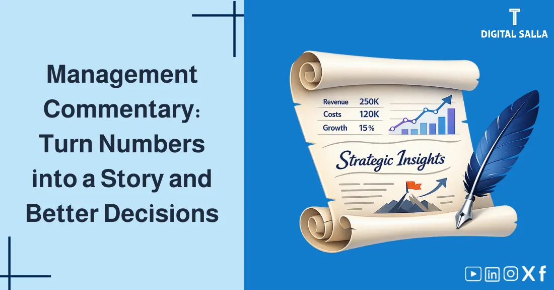
Writing a Management Commentary: How to turn numbers into a story and decision?
Writing a Management Commentary: How to turn numbers into a story and decision?
CEOs don’t have time to read 100 pages of general ledgers. They need the “So What?”—the insight behind the number. Management Reporting is the art of translating rigid accounting data into actionable business intelligence. In this guide, we master the skill of Financial Storytelling: How to structure a professional report? How to analyze variances (Budget vs. Actual)? And how to write an Executive Summary that gets approved in 3 minutes.
- The fundamental difference between Financial Statements (for outsiders) and Management Reports (for insiders).
- The Pyramid Structure: How to start with the conclusion, not the details.
- Variance Analysis: How to explain the “Why” (Price vs. Volume).
- Visual model (SVG) of the data-to-decision flow.
- The “So What?” test for every number you present.
- Interactive Tool: An automated generator for Executive Summaries and Variance Analysis notes.
- A professional checklist for report quality control.
1) Statutory vs. Management Reporting
| Feature | Financial Statements (Statutory) | Management Reports (Internal) |
|---|---|---|
| Audience | External (Investors, Tax, Banks) | Internal (CEO, Board, Managers) |
| Rules | Rigid (IFRS / GAAP) | Flexible (Needs of the business) |
| Focus | Historical (What happened?) | Forward-looking (What will happen?) |
| Detail | Aggregated (Company-wide) | Segmented (By Product, Branch, Team) |
2) The Pyramid Principle (Conclusion First)
Executives are busy. Never start with the background. Start with the answer.
- Top: The Main Insight/Action (e.g., “Profit dropped 10% due to material costs; we recommend raising prices”).
- Middle: Key Drivers/Arguments (The main reasons supporting the conclusion).
- Bottom: Detailed Data/Evidence (The tables and charts proving the arguments).
3) The “So What?” Test
For every number you write, ask “So What?”. If there is no answer, delete the number.
Good: “Revenue missed target by 5% primarily due to the delay in Product X launch. We expect to recover this in Q3.” (This is Insight)
4) Visual Logic: From Data to Decision
5) Variance Analysis Techniques
When Revenue misses the budget, dig deeper:

Treasury & Cash Flow Dashboard - Excel File
- Price Variance: Did we sell at a lower price/discount?
- Volume Variance: Did we sell fewer units?
- Mix Variance: Did we sell more of the low-margin products?
6) Interactive Report Generator
Enter your key figures to auto-generate a draft Executive Summary and Commentary:
7) Data Visualization Tips
- Less is More: Don’t clutter charts. Remove gridlines and borders.
- Use Colors Strategically: Green for good, Red for bad, Grey for context.
- Waterfall Charts: The best way to show the bridge between Budget and Actual.
8) Frequently Asked Questions
How long should the management report be?
The “Deck” can be 10-20 slides, but the Executive Summary must be 1 page max. If you can’t say it in one page, you don’t understand it well enough.
Should I report bad news?
Absolutely. Bad news early is “Information”; bad news late is a “Surprise”. Management hates surprises. Report it, explain it, and propose a fix.
9) Conclusion
The summary is simple: Your value as a finance professional is not in calculating the number, but in communicating it. By moving from “Data Dumping” to “Storytelling,” you transform from a back-office accountant into a strategic business partner.