


Pivot Tables: Analyzing Large Data in Seconds
Pivot Tables: Analyzing Massive Data in Seconds
Pivot Table Explanation is the shortest way to turn a “massive” table into a clear report: Pivot Tables summarize data within seconds, allowing you to analyze sales, expenses, or receivables by Account, Branch, or Period without building complex formulas. In this guide, you will learn how to build a correct Pivot from the first time, how to avoid common mistakes, and how to link it with automation and dashboard phases.
- Practical understanding of Pivot Tables and how they work behind the scenes (Pivot Cache).
- Steps to prepare data so that grouping or date errors do not appear.
- List of most important fields: Rows/Columns/Values/Filters + Slicers.
- Small example clarifying “Raw Data” vs “Pivot Summary” ready for presentation.
1) What is a Pivot Table? (Simple Definition for Accountant and Financier)
Pivot Table is a tool inside Excel that transforms a large data table into a summary that can be changed quickly (Pivot) by swapping fields. Instead of browsing thousands of rows, you can see total amounts by Account, by Branch, or by Month—then click on a specific number to reach its details.
2) Why is Pivot important in data summarization and building Excel reports?
In financial work, many questions recur in different forms: How much did we spend? Where did the cost increase? Which branch is better? Who is the best-selling customer? Pivot makes the answer faster because you change the viewing angle without editing formulas.

Budgeting & Forecasting Model - Excel File
- Speed: Summarizing thousands of rows in seconds.
- Flexibility: Moving fields between Rows/Columns/Filters easily.
- Accuracy: Reducing errors of repetitive formulas when the goal is a clear “summary.”
- Scalability: Same Pivot can be updated with new data (Refresh).
3) Preparing Data Before Pivot (Quality): The Step Preventing 80% of Problems
The best Pivot in the world won’t save you if the data is undisciplined. Before creating a Pivot Table follow these rules:
| Rule | Why Important? | Common Mistake Example |
|---|---|---|
| Clear Column Headers | Pivot relies on field names | Column without header or duplicate header |
| One Line Per Transaction | To avoid inflation or duplication in aggregation | Merged cells or totals inside the table |
| Standardize Dates | Grouping by Month/Quarter/Year requires valid dates | Dates as text or different formats |
| Convert Range to Table | Facilitates expansion and updating and prevents missing new data | Adding rows outside the range so they don’t enter Pivot |
4) Pivot Table Explanation Step-by-Step: Creating First Pivot in 5 Minutes
- Organize Data as a Table (Insert → Table) and ensure headers.
- Select any cell inside the table then Insert → PivotTable.
- Choose Pivot Location (New Worksheet is often better initially).
- Drag Fields to Rows/Columns/Values/Filters according to required report.
- Refresh when data changes (Right Click → Refresh or Data → Refresh All).
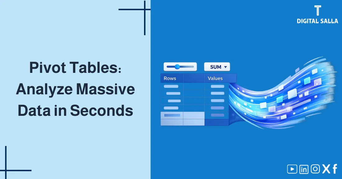
5) Understanding Pivot Fields: Rows/Columns/Values/Filters (With SVG Illustration)
Pivot consists of 4 areas—understanding them makes building reports much easier:
- Rows: Main dimension (like Branch or Account).
- Columns: Second dimension (like Month or Transaction Type).
- Values: Metric (Amount/Quantity/Count of Invoices).
- Filters: General filter (like Year or Department).
6) Advanced Tools: Grouping + Slicers + Calculations
After the first Pivot, you will need tools to make the report “interactive” and easy to read:
6.1 Grouping for Dates
You can group dates automatically into Month/Quarter/Year. If grouping fails, the reason is often: Dates as text or presence of empty/invalid cells in the Date column.
6.2 Slicers for Quick Filtering
Slicer allows the user to change the filter with a click instead of opening long lists. Excellent in management reports or daily monitoring reports.
6.3 Calculated Fields / Show Values As
For simpler experiments try “Show Values As” to show percentage of total or change between periods. And when logic gets complex move to better modeling (Power Pivot/Measures).
7) Pivot vs Formulas vs Power Query vs Power BI: When to use what?
| Tool | When is it best? | Limits |
|---|---|---|
| Pivot Table | Quick summary + Exploration + Dynamic Excel Reports | Relies on data quality; Update needs Refresh |
| Formulas (SUMIFS/XLOOKUP) | Specific models and calculation logic inside tables | May become complex and hard to maintain with large data |
| Power Query | Cleaning/Merging/Transforming data repetitively | Not a final presentation tool; dedicated to preparation |
| Power BI | Dashboards and sharing indicators at management level | Requires data model and clear KPI definition |
8) Quick Practical Example: From Raw Data to Pivot Summary
Suppose a simple table for expense/sales transactions (each row = one transaction). Goal: Summarize amounts by Branch then by Month.
| Date | Branch | Account | Amount |
|---|---|---|---|
| 2026-01-03 | Riyadh | Transport Expense | 1,250 |
| 2026-01-05 | Jeddah | Maintenance Expense | 980 |
| 2026-01-11 | Riyadh | Transport Expense | 760 |
| 2026-02-02 | Jeddah | Transport Expense | 1,100 |
| 2026-02-10 | Riyadh | Maintenance Expense | 1,450 |
| 2026-02-19 | Riyadh | Transport Expense | 900 |
| Branch | Jan 2026 | Feb 2026 | Grand Total |
|---|---|---|---|
| Riyadh | 2,010 | 2,350 | 4,360 |
| Jeddah | 980 | 1,100 | 2,080 |
| Grand Total | 2,990 | 3,450 | 6,440 |
9) Common Mistakes and How to Avoid Them
- Presence of Totals inside Raw Table: Pivot will sum them again → Inflated results.
- Invalid Dates: Prevents Grouping and distorts Month/Quarter reports.
- Adding New Data Outside Range: That’s why we use Table to include rows automatically.
- Changing Field Names: May break Pivot or make it lose fields.
- Confusing Sum and Count: Check Values setting (Amounts = Sum, Invoices = Count).
10) Quick Learning Plan in One Week (Without Complexity)
- Day 1: Organize Data as Table + Quality Rules.
- Day 2: Simple Pivot (One Row + One Value) + Refresh.
- Day 3: Columns + Date Grouping.
- Day 4: Filters + Slicers + Pivot Formatting.
- Day 5: “Show Values As” (Percentage/Difference) + Comparisons.
- Day 6: Accounting Scenario: Expenses by Cost Center or Branch.
- Day 7: Transforming repetitive preparation into Power Query then rebuilding Pivot.
11) Frequently Asked Questions
What is a Pivot Table in short?
A Pivot Table is a tool within Excel that summarizes data in seconds by grouping it by fields such as Account, Branch, or Date, without the need to write many formulas.
What is the best way to prepare data before creating a Pivot?
Convert data range to a Table, ensure clear column headers, clean values (spaces/duplicates/data types), and standardize dates and codes before aggregation.
Does Pivot Table replace SUMIFS and VLOOKUP?
Pivot is excellent for summarization and exploration, but you might need SUMIFS for aggregation within specific models, and XLOOKUP/VLOOKUP for linking and classification before displaying results in Pivot.
Why doesn’t Pivot update after data modification?
Pivot does not always update automatically. Use Refresh/Refresh All, and verify that the data source is still within the Table or correct range.
When do I use Power Query or Power BI instead of Pivot?
If data preparation is repetitive (merging files and cleaning columns), use Power Query. If the goal is a monitoring dashboard and sharing indicators at the management level, use Power BI.
12) Conclusion
Pivot Table Explanation in essence is learning how to summarize data quickly and change report angle without rebuilding formulas. Start with data quality, then simple Pivot, then add Grouping and Slicers, afterwards move to automation and dashboard when needed. This way you will build dynamic Excel reports that reduce analysis time and increase confidence in numbers.